Chart Comparison Animation | Data Drop vs Growth Highlight
ByDescription
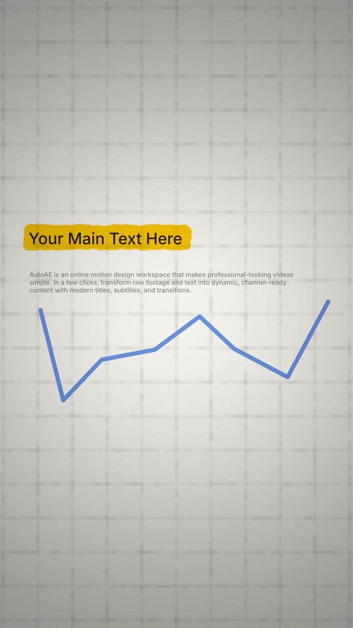
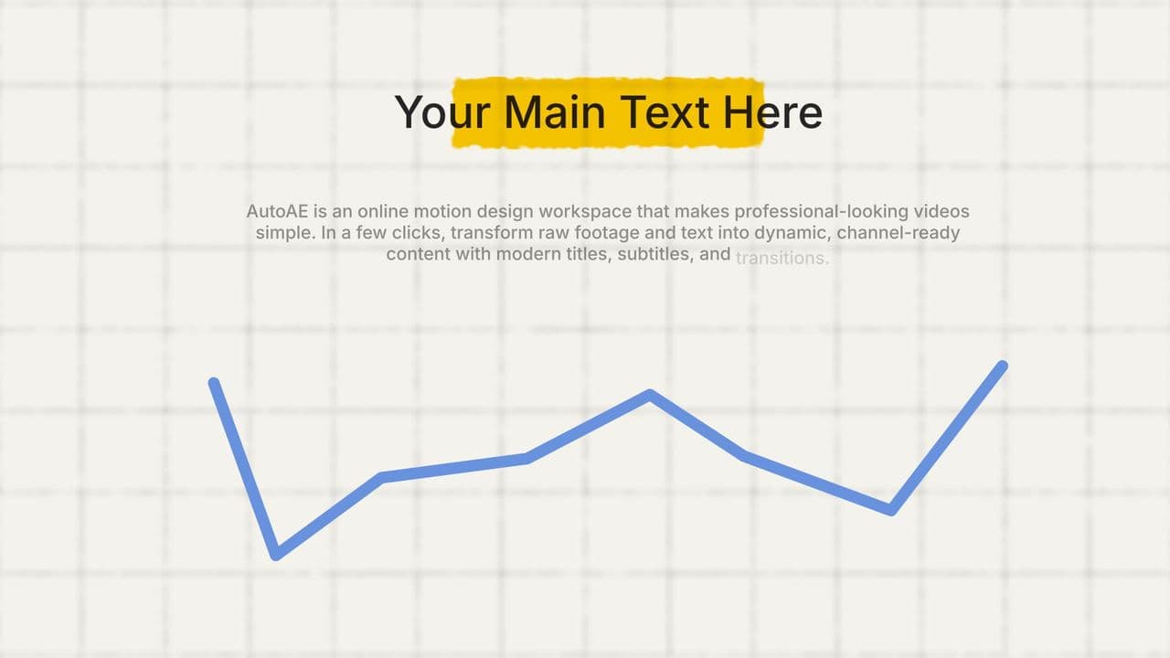
This trending line chart animation vividly illustrates the contrast between a data low point and a strong upward rebound. With a sharp animated dip and a glowing surge, it draws attention to key turning points—perfect for visualizing failures vs breakthroughs, losses vs wins, or before-after transformations. Ideal for YouTube creators, finance channels, startup storytelling, pitch decks, and performance recaps. Whether you’re highlighting a bounce-back moment, showing market recovery, or explaining growth after setbacks, this motion chart helps your audience instantly grasp the impact with clean, dynamic visuals.
Details
9s
1080x1920
3 texts
2 images
Similar Animations

Chart Comparison Animation | Data Drop vs Growth Highlight

Flat vs Exponential Growth Animation | Chart-Based Visual Comparison

Flat vs Exponential Growth Animation | Chart-Based Visual Comparison

Animated Growth Chart for 2 Logo Performance Comparison

Glowing Line Graph Animation for Upward Trend

Explosive Growth Animation | Dynamic Line Chart Mockup

Explosive Growth Animation | Dynamic Line Chart Mockup

Line Chart Animation with Highlighted Data Point | Trend Visualization
More Hooks By Davinci

1 Text Hand-painted Revolver Flag Reveal

Vintage Parchment Paper Title Animation

2 Media 1 Text Vintage Investigation Board Showcase

2 Media Vintage Evidence Timeline

2 Photo 1 Text Investigation Board Opener

Horizon Vintage Scrapbook Reveal

Vertical Vintage Scrapbook Reveal

1 Text Artistic Rainy Title Animation
More Text Animation Templates

AutoAE SaaS Launch S2 Pt.2 · Social Proof

AutoAE SaaS Launch Pt.1 · Bold Slogan Opener

AutoAE SaaS Launch Pt.2 · Hook Question Transition

AutoAE SaaS Launch Pt.4 · Text-Driven Solution Highlights

AutoAE SaaS Launch Pt.6 · Dynamic CTA

SaaS Launch Video Opener Minimalist Showcase

SaaS Launch Video Browser Window Showcase

SaaS Launch Video Minimalist Typography Reveal
More Animated Flowchart Templates

2 Main Text Hand-painted Magnet Comparison

3 Slide Film Burn Process Steps

3D Sphere Character Animation: 3 Factors to Final Result

Interactive Icon Click Comparison & 4-Text Conclusion Animation

Podium Winners Animation: 3 Logo Ranking & Comparative Reveal

Dynamic Line Graph Animation with Highlight

Dynamic Line Graph Animation with Highlight
